Shepherds


Original Logo
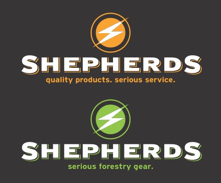
A major supplier to the Hydro, Utilities, Forestry, Telephone and C.A.T.V industries, Shepherds, has been a family business for three generations. Their dated identity was long overdue for a makeover and they wanted a younger, more dynamic look for their two divisions. Vibrant colours combined with a direct, no nonsense tagline appeals to the serious target market. While several radically different designs were explored, the winning concept delivered the desired contemporaneity while maintaining familiarity for long standing clientele.