Packaging


Cott Beverages
Elmer’s
Fish Crisp
Légère
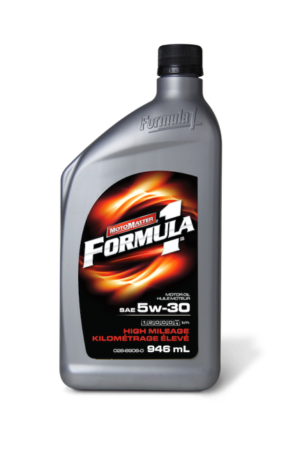
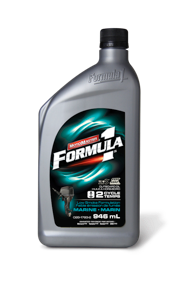
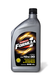
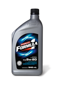
Formula 1
With a name like Formula 1, Canadian Tire’s premium oil had to look like it could deliver the quality and performance that would be expected. A new crisp logo, dynamic, sizzling graphics, and foil label combined with the overall cleaner look achieved just that. This overhaul, along with the new Motomaster logo helped raise the bar in the category.
Avery
Canadian Tire