Packaging

Energy drinks are a competitive and heavily saturated category. In order to secure a new retail account, Cott’s design challenges were clear - create a product name and complementary design to establish credibility and arouse interest in their new product.
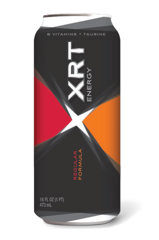
XRT is a playful interpretation of the word, ‘exert’. The acronym was the basis for the X mnemonic and provided the opportunity to create an edgy, youthful design intended to attract the target market. The design translated well to a sugar-free offering and maintains the same impact as the original design.
XRT
Energy Drink

(concept only)

Cott Beverages
Elmer’s
Fish Crisp
Légère
Avery
Canadian Tire